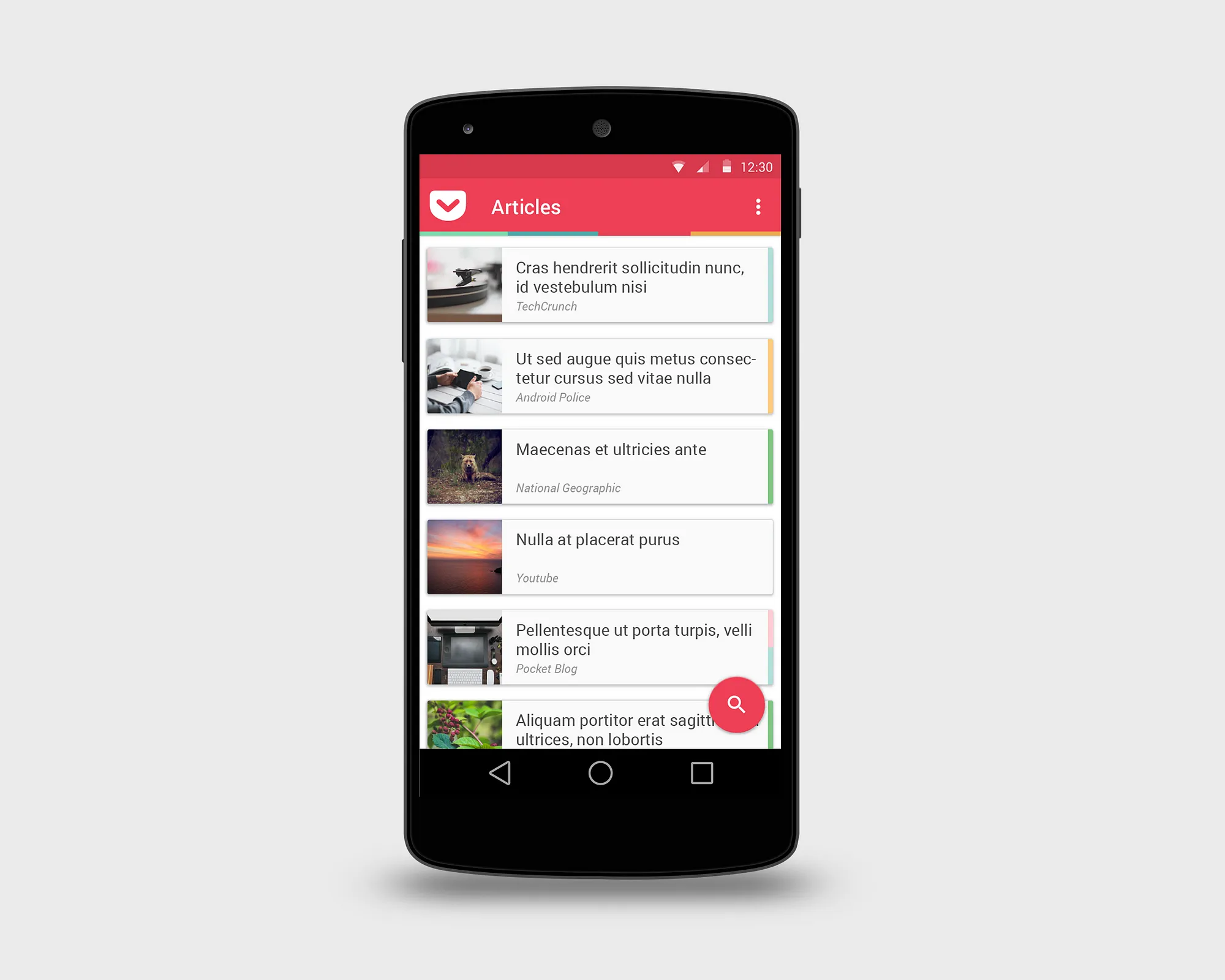
I LOVE Pocket. It’s one of the first apps that I install whenever I have a new device and one of the few that I open every day.
That’s because I read. A lot. Of everything.
Novels, comics, non-fiction, magazines and, obviously, stuff online. Pocket makes it easy and gorgeous to read non-paper articles and collect them. But, after the advent of Google’s Material Design and Android Lollipop I feel something wrong everytime I open the app.
It could be better. In fact, it should be better.
So, this is how I see a perfect Android Pocket.
