Leemo is a social app that enables users to capture memories and leave their mark by sharing geo-located content. As part of the project, I was tasked with designing its branding, including the logo and icons. These designs are also featured on the website and the app.
The process
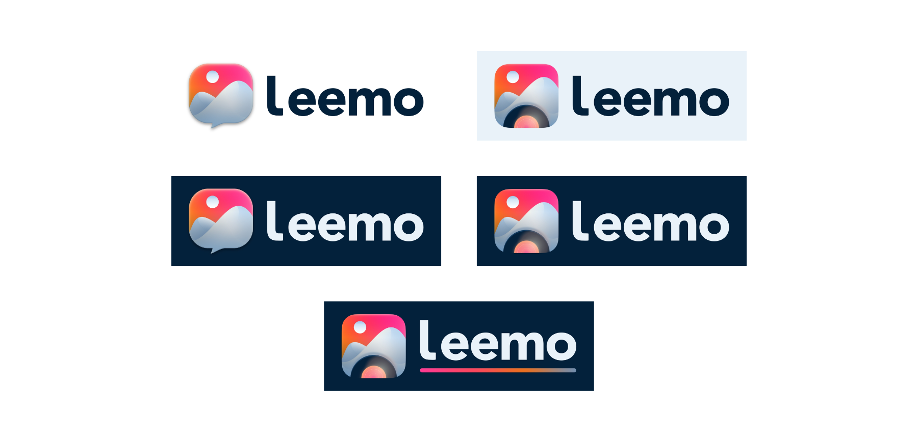
Initially, I aimed for a bold logo that combined symbols commonly associated with messaging apps, photography, and cameras. However, feedback indicated that the icon’s representation was unclear.
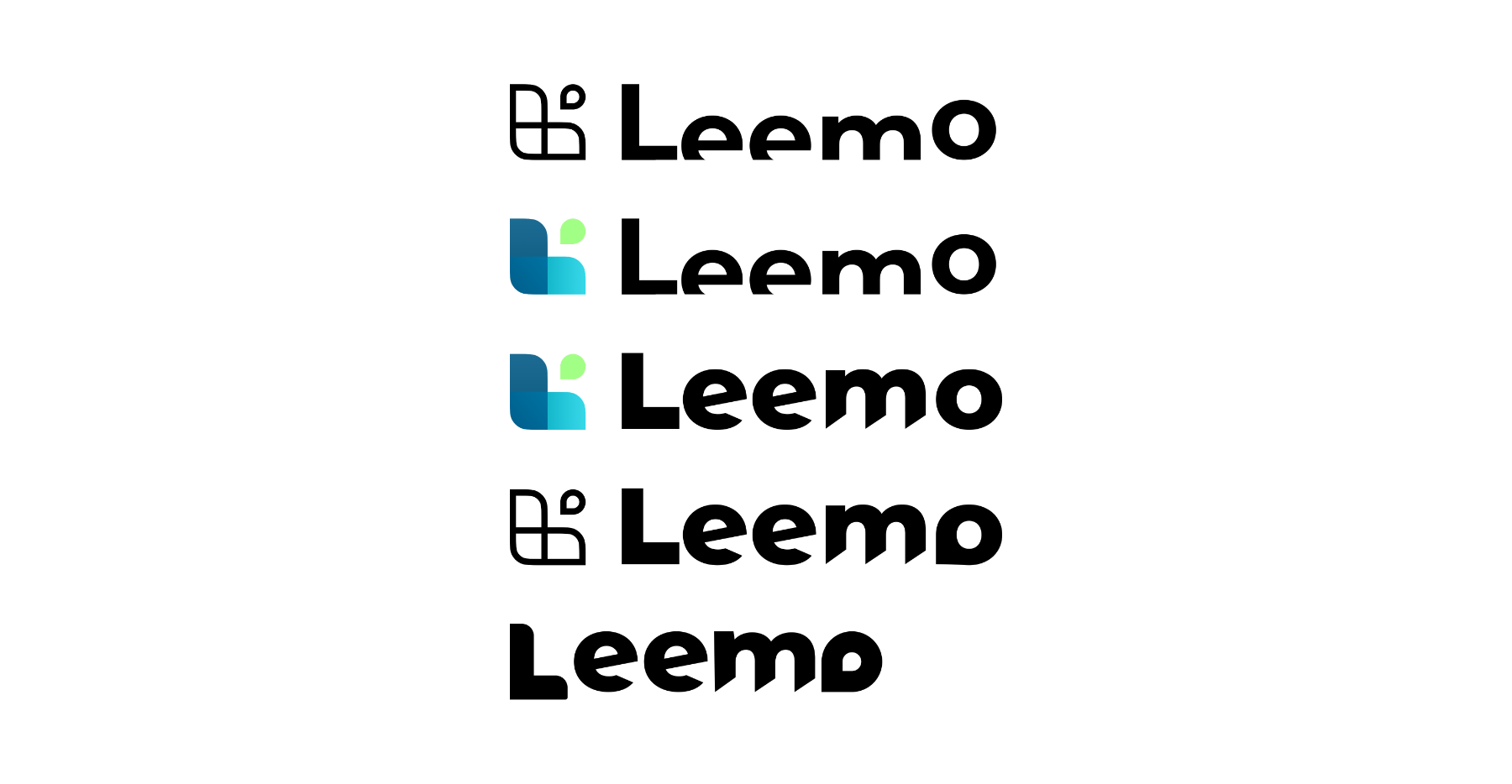
To create a unique and modern look, I experimented with various font families and ultimately chose Avenir Next. I made subtle modifications to the letterforms to enhance uniqueness. Below are some iterations from Figma, showcasing the evolution toward the final design.
Here are some tests taken directly from Figma.1 You can see the final result taking shape.
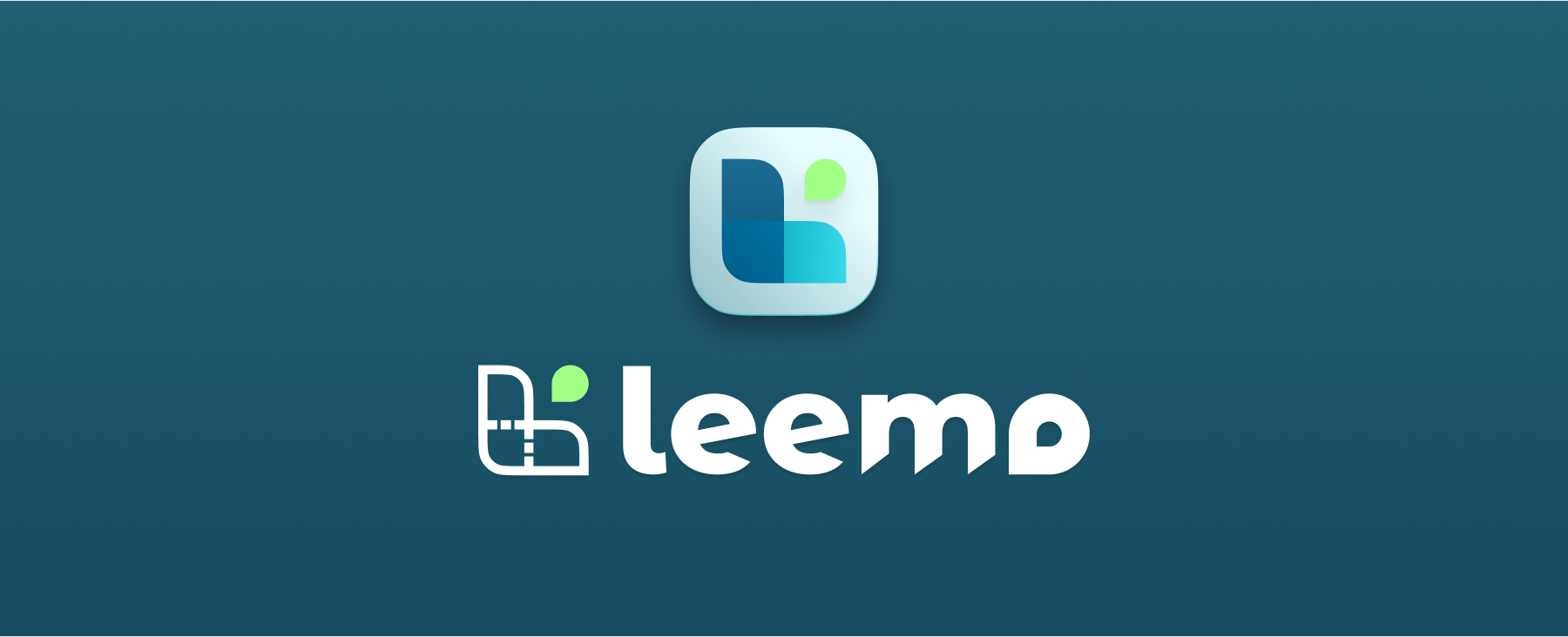
And here’s the final result:
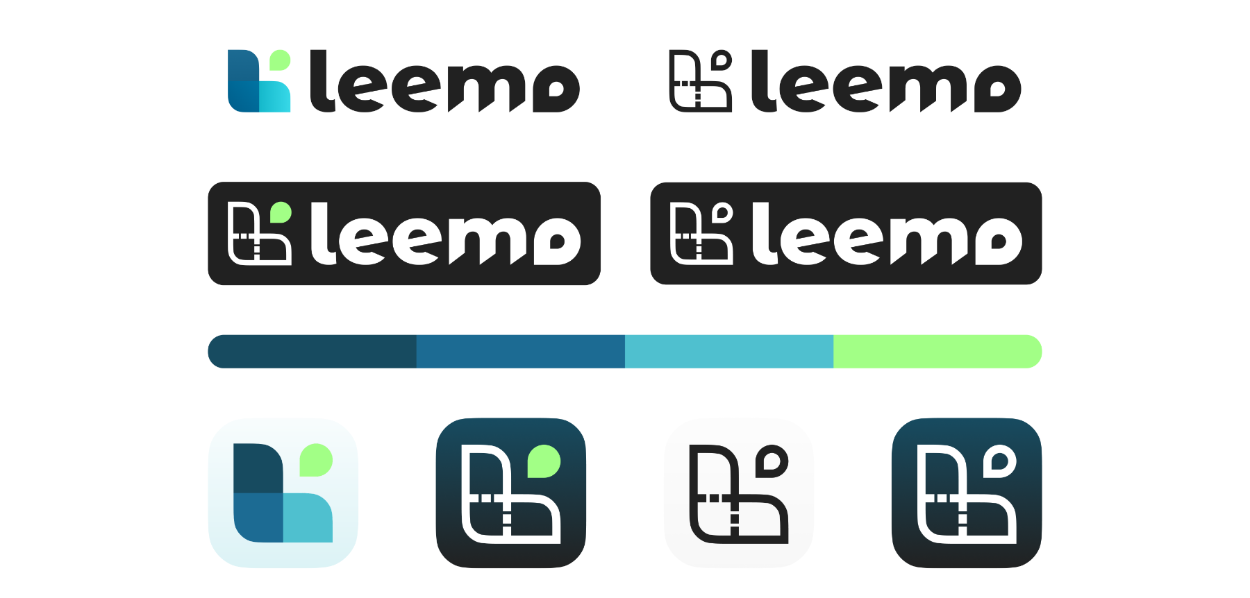
In terms of colour palette, I transitioned from warmer reds and yellows to cooler tones that align better with Leemo’s default dark theme.

Related
I designed Leemo’s website and its mobile app as well.
Footnotes
-
Yes, some of these look bad. But that’s what you get when you play around with shapes trying to get the right balance. ↩